
May 16, 2024, marks the 100th anniversary of Walter A. Shewhart’s wonderful discovery.
Social Sharing block


Walter A. Shewhart is lauded as the Father of Statistical Process Control (SPC) and is perhaps best remembered for the SPC control chart. The first record of Shewhart’s control chart is found in a Bell Telephone Laboratories internal memo from May 16, 1924, making today the 100th anniversary of Shewhart’s wonderful discovery.
|
ADVERTISEMENT |
Shewhart went on to write two monumental books that are the source of practically all references to his work in and around SPC: Economic Control of Quality of Manufactured Product, originally published in 1931; and Statistical Method From the Viewpoint of Quality Control, published in 1939 and edited by W. Edwards Deming.
 Shewhart worked at Bell Telephone Laboratories in New York until his retirement in 1956, some 17 years after his 1939 book. He wrote many papers throughout the 1920s, ’30s, and ’40s, and remained active in mathematical statistics after the publication of his two famous books. He lectured in the United States and overseas, including at University College London in 1932.
 The first record of Walter Shewhart’s control chart is found in a Bell Telephone Laboratories internal memo from May 16th, 1924. The first record of Walter Shewhart’s control chart is found in a Bell Telephone Laboratories internal memo from May 16th, 1924. |
He was also a founding member and fellow of the Institute of Mathematical Statistics, and a fellow of the American Statistical Association as well as its president in 1945. The American Society for Quality Control, now called the American Society for Quality (ASQ), established the Shewhart Medal, first awarded in 1948, which is still awarded annually.
While a book could, and probably should, be written to more completely honor Shewhart’s contribution to industrial statistics and manufacturing, I’ll focus on the “voice of the process” and how three of the pillars of Shewhart’s work allow a process to talk to us via the data we collect. Listening to this voice can catalyze real and sustainable process improvements. The greatness of Shewhart’s discovery isn’t just the discovery itself but the fact that, a century later, his work is still very relevant.
Two types of variation
Integral to Shewhart’s work was his recognition of two types of variation: chance causes and assignable causes. Nowadays, we tend to read of common causes of variation, also called routine variation, and special causes of variation, or exceptional variation, respectively. I prefer the terms routine variation and assignable cause variation.
An assignable cause signals a process change. Identifying the cause of the change, through investigation, provides a basis for action. The benefit, or improvement, comes from the actions taken. This is summarized in Figure 1: detect, investigate, and action.
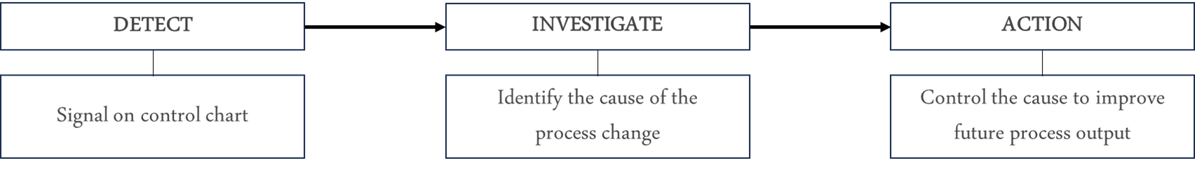
Figure 1: Shewhart’s approach to assignable cause variation
Detecting assignable cause variation
How to detect an assignable cause is where the control chart comes into play because, using the control chart, Shewhart operationally defined an assignable cause to be a point outside a control limit, as illustrated in Figure 2. While other “rules” to detect assignable causes were subsequently proposed and introduced into practice—modern day statistical software offers many, or all, of these rules—here we focus on a point outside a control limit as the detection rule. In practice, this rule is often all that’s needed. It avoids overcomplication while still detecting enough signals to keep a proactive team learning and active. (Note: Shewhart discussed other criteria additional to a point outside a limit on pages 338–340 of his 1931 book.)
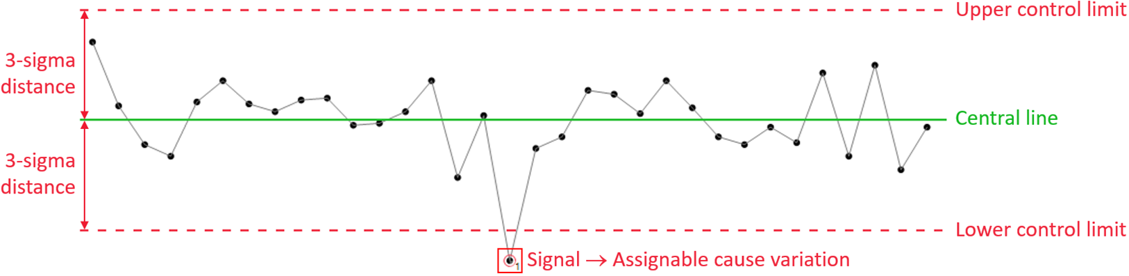
Figure 2: Basic illustration of a control chart
Shewhart’s operational definition of an assignable cause was built on his design of the control chart and the positioning of two control limits, as seen in Figure 2. Shewhart’s control limits are positioned at ±3 sigma (plus or minus three standard deviations) from the central line on the control chart. His choice of symmetrical ±3 sigma applied across the board—hence, to control charts for averages, standard deviations, fraction defective, and so on.
The three pillars
What did I mean by three pillars? Referring to Shewhart’s 1931 book, we find the following three elements.
Rational subgroups: Shewhart introduced, and advocated, the thoughtful use of rational subgroups, which focuses on how the data can best answer the important questions regarding a process. In doing so, he argued, you will be “...inherently better off” (page 299).
Sigma: Shewhart provided clear guidance on how to, and, importantly, how not to, calculate sigma (i.e., standard deviation) to detect assignable causes—or “trouble,” to quote Shewhart (page 302).
Control limits: Writing that “t = 3 is an acceptable economic value,” Shewhart decided to position the control limits at a distance ±3 sigma from the control chart’s central line (page 277).
Figure 3 illustrates the relationship of these pillars. The examples following it put some “meat on the bone” of these pillars, and also show how they enable the control chart to serve as an engine of learning and continual improvement.
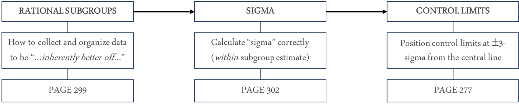
Figure 3: Three pillars of Shewhart’s work
When used effectively, these three pillars mean that a point outside a control limit is unlikely to have happened by “chance.” In other words, an assignable cause—a reason for a change having occurred in the process—is volunteering itself to be identified (such as the “signal” in Figure 2). As noted, Shewhart likened assignable cause variation to process “trouble” (e.g., page 290). Finding the cause and taking an effective course of action won’t just improve the process; it will also help to develop process knowledge.
If you doubt this, the examples below might help to catalyze a change of thought. The best way to convince yourself, nonetheless, will be to do it for yourself. (For inspiration, there’s a great example about the beneficial use of control charts at the Tokai Rika plant in Donald Wheeler’s article “How Do You Get the Most Out of Any Process?”)
Insulation resistance data
This example comes from Shewhart’s 1931 book (pages 19–21). During the testing of a substitute, cheaper material for a certain kind of equipment, 204 measurements of insulation resistance were made. The motivation for this work was to find a lower-cost material due to the considerable cost in securing the necessary electrical insulation for the existing process.
For the 204 measurements made, subgroups of size four were used, meaning that four measurement values were in each group. The ordering of the groups was based on the time sequence of the measurements themselves. For each subgroup, Shewhart calculated the average and the root mean square deviation (as an estimate of standard deviation). When creating a control chart of the data, he asked (his words), “Should such variations be left to chance?” This question means:
• Did the data display predictable behavior, i.e., routine variation only?
• Or, did the data display unpredictable behavior, i.e., some assignable cause variation?
While Shewhart’s work used an average and root mean square deviation control chart, in this example average and range control charts are used, as seen in figures 4, 5, and 6. The range replaced the root mean square deviation during the first half of the 20th century, mainly because it was easier to calculate (back in the days of pen and paper).
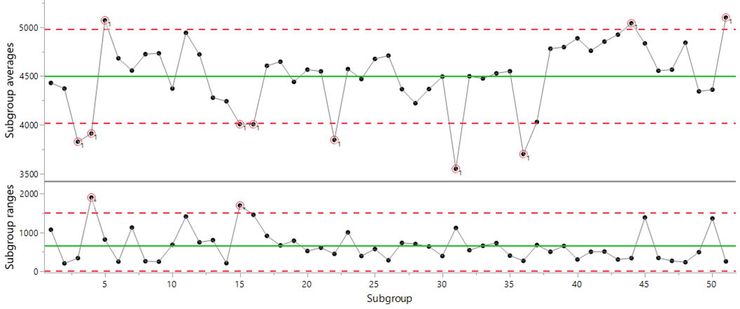
Figure 4: Average and range control chart of the insulation resistance data
To Shewhart’s question, “Should such variations be left to chance?” the answer was a definitive no. He wrote, “Several of the observed values lie outside these limits. This was taken as an indication of the existence of causes of variability which could be found and eliminated [i.e., assignable causes].”
The causes were searched for and, per Shewhart “...several were found, and after these had been eliminated, another series of results gave the results indicated in [Figure 5].” Figure 5, below, is an average and range chart using the data collected after the actions taken to eliminate the effect of the identified causes.
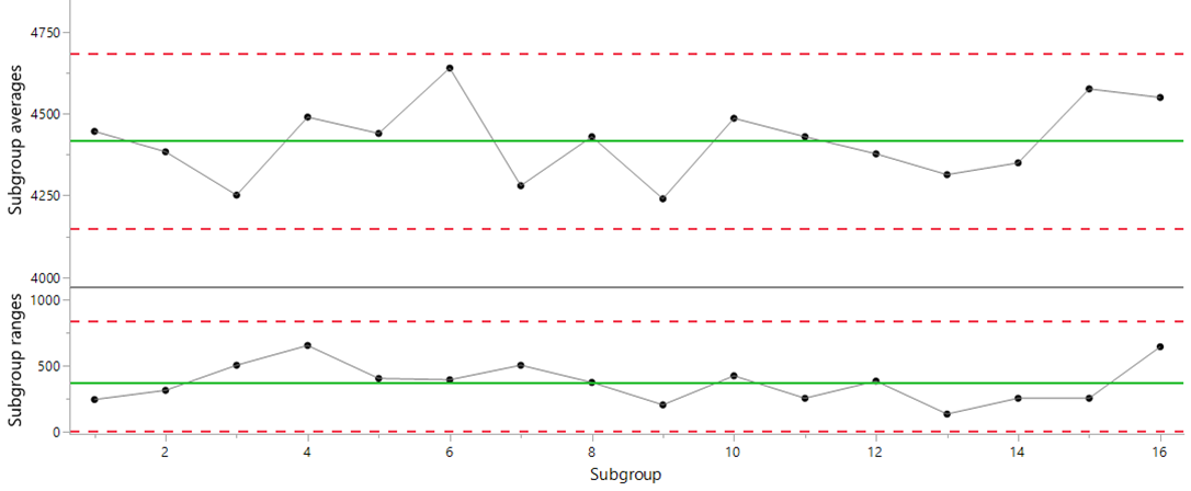
Figure 5: Average and range control chart of the insulation resistance data after the elimination of identified assignable causes
In Figure 5, there’s no indication of an assignable cause in either chart—no signals in the subgroup averages or the subgroup ranges—meaning that these data are consistent with predictable behavior, i.e., routine variation. Meanwhile, Shewhart “assumed... that it was not feasible to go much further in eliminating causes of variability... more work was done but... [the effort] failed to reveal causes of variability.”
Shewhart closed this discussion by writing, “Here, then, is a typical case when the criterion indicates when variability should be left to chance.”
In other words, consider it futile—akin to chasing shadows—to seek to explain specific points, or groups of points, when assignable cause variation (or process changes) are not detected by a control chart.
Putting the before-and-after results side by side, as shown in Figure 6, we see not only the significant improvement achieved by acting on assignable cause variation, but also that Shewhart effectively discovered a way of deciding when to, and when not to, invest time in explaining specific process outcomes: If there are signals on the control chart, investigate them. If not, (and in Figure 6’s “after data,” there are not), don’t waste your time and energy seeking to explain “chance cause variation.”
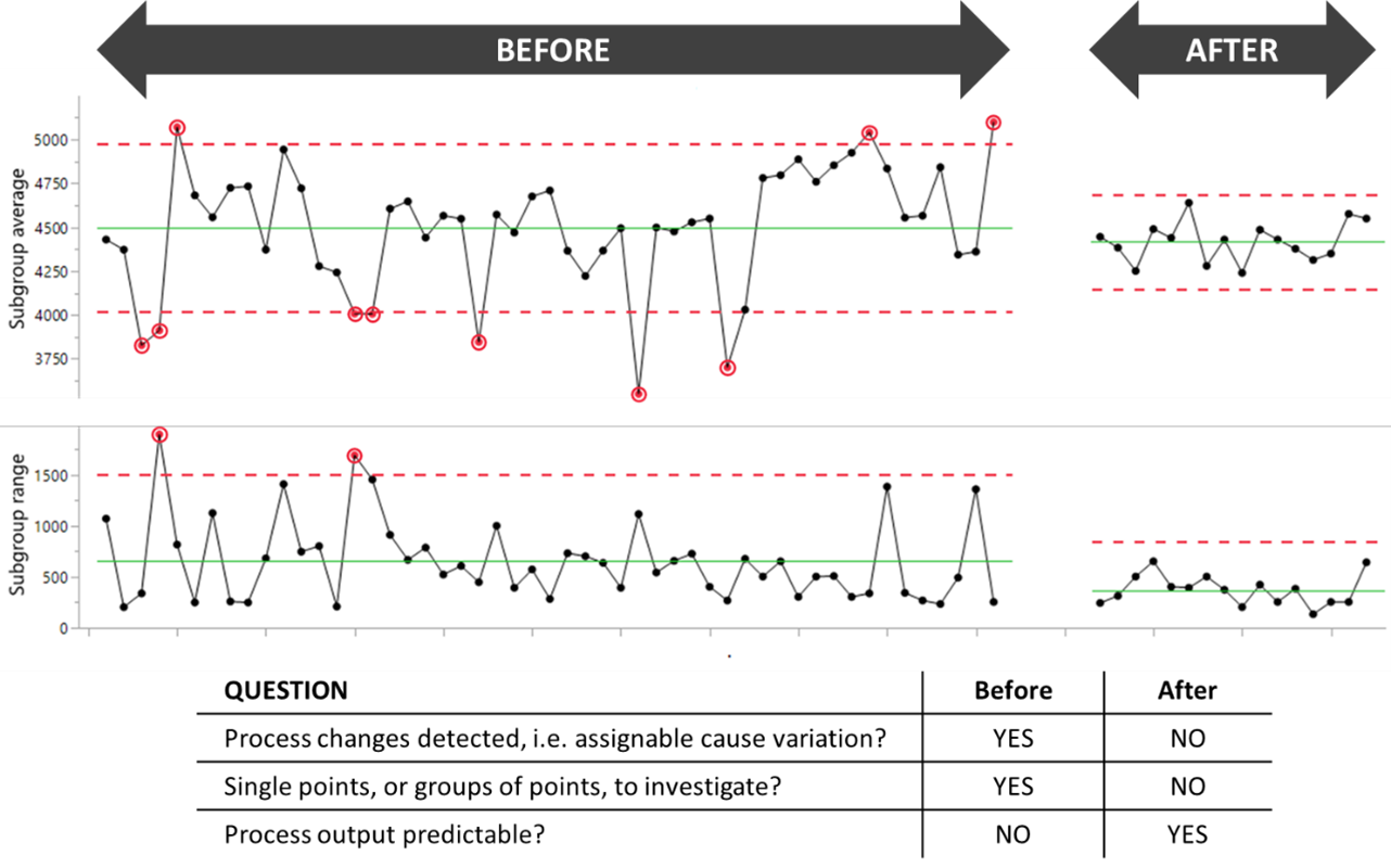
Figure 6: Average and range control charts of the before-and-after insulation resistance data
Concluding this example, the references above to single pages in Shewhart’s book may give the misleading impression that he didn’t dig deep in his search to understand and characterize chance cause variation and assignable cause variation. However, Part VI of his 1931 book (pages 275–347) is one place where Shewhart dug deep in determining when variation ought not be left to chance.
Hardness measurements on welded parts
Shewhart, on pages 324–325, asked whether a series of hardness measurements presented evidence of assignable causes between two parts: Part 1 and Part 2. If present, assignable causes should be eliminated because “...it is very desirable to control the hardness of a particular kind of apparatus.” Shewhart listed on page 324, Table 46, “the hardness measurements on each of the two parts for fifty-nine pieces of this apparatus.”
To examine these data for evidence of assignable causes, an average and standard deviation control chart can be used. Two subgroups were used: one subgroup for the Part 1 data, and a second subgroup for the Part 2 data. The chart is shown in Figure 7.
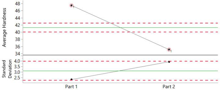
Figure 7: Average and standard deviation chart for the hardness data
The averages for the two parts fall far outside the limits on the average chart. As Shewhart wrote “...the heat treatment [in the welding together of the two parts] constitutes an assignable cause of variability in the hardness of the finished product.” The average hardness of Part 1 was some 12 Rockwell units higher than Part 2 (average values of 47.4 and 35.1 units, respectively).
With the voice of the process so clearly describing the difference in hardness between the two parts, improvements in the quality of the apparatus under study—i.e., improved “control [of] the hardness of [the] apparatus”—would result by achieving greater consistency, or alignment, in the heat treatment used to weld the two parts together.
Ball-joint socket data
This example (used with permission) from Donald J. Wheeler’s book, Understanding Statistical Process Control (SPC Press, 2010, section 5.3, pages 102–112), illustrates the importance of rational subgrouping and why I think of it as a “pillar” (see Figure 3). A thoughtful collection and use of data—inherent to rational subgrouping—is imperative if the voice of the process is to communicate to you the essential features, good or bad, of the process under study. As Shewhart argued, with an effective use of rational subgroups you will be “...inherently better off...” (page 299 of Shewhart’s 1931 book).
The data in this example represent the effective thickness of a socket, measured in hundredths of a millimeter. Injection molding is used to make the sockets, and four pieces are made at a time. A socket can come from one of four cavities, as illustrated in Figure 8.
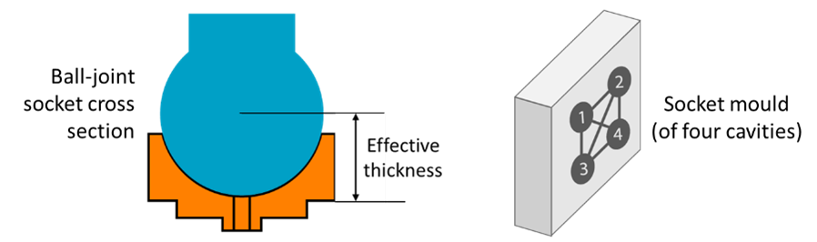
Figure 8: Illustration of a ball-joint socket and the mold
After careful thought and some experimentation with different organizations of the data, the average and range chart shown in Figure 9 was used. (For the complete story, including a fuller discussion with charts, of the different organizations of the data, refer to Wheeler’s book. Or for an abridged version by the same author, see “Rational Subgrouping.”)
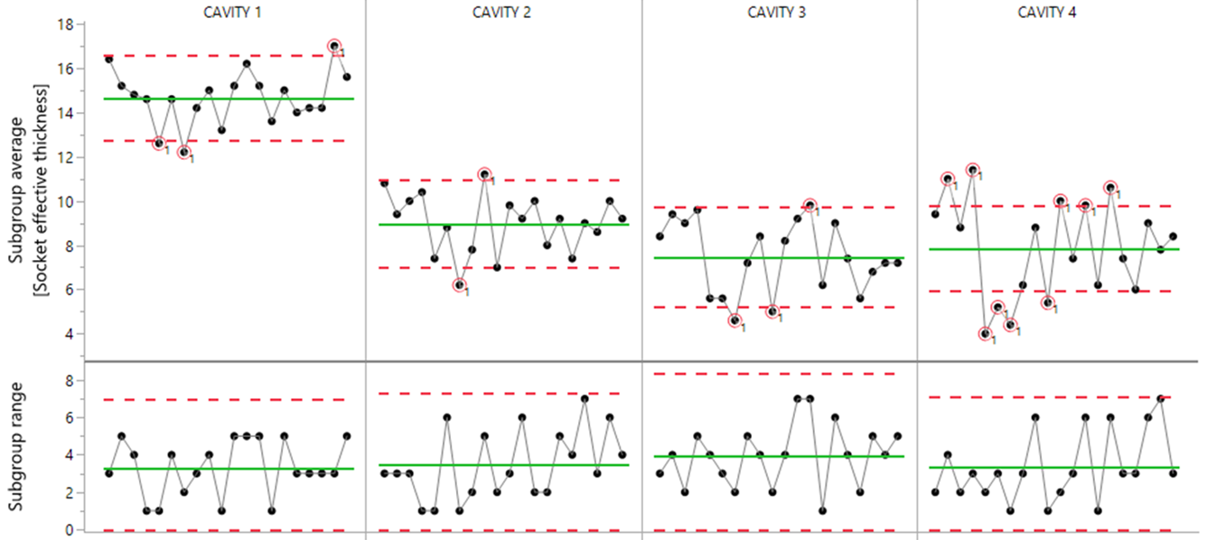
Figure 9: Average and range chart of the ball-joint socket data
The “interesting” part of the figure is the average chart with a plentiful supply of signals (or differences or inconsistencies in the process). The range chart is less eventful, indicating a good degree of consistency within the subgroups.
The average chart shows that Cavity 1 is clearly producing thicker parts. Cavities 2, 3, and 4 are much closer in average thickness, but not one of the cavities displays predictable behavior over time, as evidenced by the proliferation of signals that indicate hour-to-hour process inconsistencies. Moreover, the average effective thickness of sockets from all four cavities was too high compared to the target of 0.05 mm.
The team investigated the signals, and two main actions resulted:
• In the tool room, different-sized shims were placed behind the cavities to lower the average effective socket thickness from each cavity.
• The cleaning procedure was modified; a more frequent cleaning of the cavities during production would prevent a wax buildup that caused the hour-to-hour inconsistencies.
To test and confirm the effectiveness of these actions, new data were collected, resulting in Figure 10’s average and range chart. Figure 10 substantiates that 1) process consistency, i.e., predictable process behavior, had been achieved; and 2) that the actions undertaken had brought the socket effective thickness down to its target value (the average of 4.66 isn’t statistically different from the target value of 5).
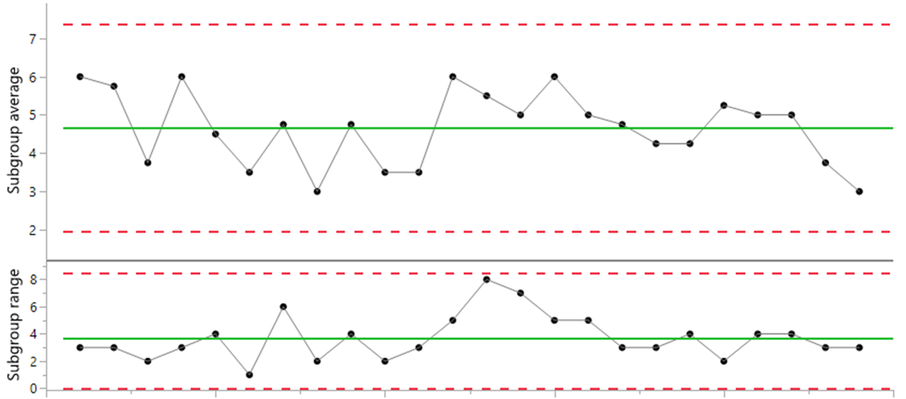
Figure 10: Average and range chart of the new data
As demonstrated in this example, when using Shewhart control charts, inherent to success is 1) the thoughtful collection and use of the data; 2) technically correct charts; and 3) the investigation of signals and effective actions as follow-through.
The benefits?
• Improved process and product knowledge
• Better and more consistent quality
• Lower operating costs
For additional comments on rational subgrouping, see the postscript at the end of this article.
Melting time
This final example introduces and discusses one-value-per-time-period data, which are the kind of data many users of control charts have to work with. Examples of such data are values obtained per hour, per shift, per day, per week, per batch, per lot, and so on. While it’s possible to put such data into subgroups, this can sometimes feel “forced” because data of this kind are naturally individual, or “stand-alone,” values.
While Shewhart did discuss such data—writing “...some advantage therefore in reducing the subgroup size to unity” (page 314, in his 1931 book)—his avoidance of control charts for individual values reflected his inability to find an effective and reliable method of calculating sigma that would be consistent with the approach he advocated on page 302 (i.e., a within-subgroup estimator of sigma; also see Figure 3).
The control chart for individual values is credited to W. J. Jennett (1942) with a first mention in print appearing to be a 1950 text by H. L. C. Tippett Technological Applications of Statistics (pages 52–54). Tippett used data from two steel furnaces, recording the time to melt each of 100 casts. In Figure 11 we see a control chart of individual values for the data from one of these furnaces. With four points above the upper limit, it’s clear: Assignable cause variation is detected, degrading the performance of this process, and the causes of these process changes are waiting to be found. Eliminating the effect of these causes would improve process consistency, enable better planning, and reduce energy costs (e.g., shorter furnace heating times).
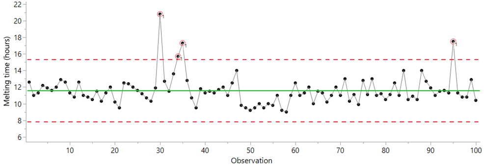
Figure 11: Control chart of the melting time data
As Shewhart did on page 302 of his 1931 book, Tippet compared two methods of standard deviation with the melting time data. He used and created limits from:
• The root mean square deviation (a global standard deviation estimator, in Excel “=STDEV.P”)
• The average moving range method (for further discussion, see “Process Capability: What it is and how it helps, Part 2”)
Tippett, like Shewhart, was also able to show the greater effectiveness of a within-subgroup estimator to detect “trouble” (i.e., assignable cause variation). Hence, from the start, the default, and technically correct, method to calculate sigma for control charts for individual values is based on the average moving range.
With individual values, Shewhart’s principles about rational subgroups are respected when:
• Consecutive values are comparable (akin to comparing apples with apples).
• The moving ranges (i.e., the differences between successive values) capture the process’s routine variation.
Achieving insightful charts for individual values when using high-frequency data isn’t always straightforward (and we can get lots of data coming at us very quickly these days). The second point especially—how to capture the process’s routine variation—requires process knowledge (e.g., how quickly or slowly can the process change?) and likely some experimentation with different uses of the data. Some guidance and practical tips can be found in “Strategies for Using SPC With High-Speed Data Collection Systems.”
Finally, note that the editor of Tippett’s 1950 text was none other than Walter A. Shewhart, providing evidence that he not only knew of the chart for individual values but supported its inclusion in Tippett’s text. Other sources substantiate Shewhart’s knowledge, and probable support of, control charts for individual values.
Summary
I’ve attempted to recognize Walter Shewhart’s work on the 100th anniversary of his first control chart memo. The brilliance of his invention—the control chart and how it gives a unique voice to the process—is discussed and backed up using four examples as well as some references for further reading. Shewhart’s work was done long before we had the computers to speed things up for us, back in the day when calculations were done using pen and paper. Simulations to test and validate his theories—which Shewhart did and documented in his 1931 book—can be done in the blink of an eye these days. But for Shewhart, these simulations probably took weeks of considerable effort.
Borrowing from a 1943 paper by Shewhart, “Statistical Control in Applied Science” (from Transactions of the American Society of Mechanical Engineers, vol. 65, pages 222–225), some points illustrative of his unique innovative capabilities and leadership in this field can be found in what Shewhart termed “contributions to mass production.” Specifically, statistical process control minimizes the cost of inspection, the number of rejections, and the tolerance range (in more modern language, it improves process capability), and maximizes quality assurance.
Some points in support of these contributions are:
1. Achieving statistical control—i.e., predictable process behavior—is fundamental to prediction and confidence about future process output (a key theme throughout Shewhart’s 1939 book).
2. Huge value (in discovery, learning, and improvement) is obtained through attention to assignable causes.
3. In terms of robustness to facilitate use in practice:
• Control chart limits (±3 sigma) aren’t strictly probability-based limits.
• Control charts are robust to the distribution of the data under study.
Amazingly, 100 years after Shewhart’s memo, the control chart is still relevant, perhaps more so than ever, as discussed in the eight-part Quality Digest series recently co-authored by Douglas C. Fair and myself (“Is Statistical Process Control Still Relevant?” Parts 1, 2, 3, 4, 5, 6, 7 and 8).
Although I became aware of Shewhart’s work some 15 years ago, it wasn’t until I attended an SPC seminar by Donald Wheeler in 2012 that I started to more fully appreciate the importance of Shewhart’s work, its relevance, and how it helps me to make better sense of data. I, for one, have good reason to be grateful to Shewhart for his contribution to industrial statistics, without which I have little doubt that my daily use of data would be inferior.
Postscript: Some notes on rational subgrouping
There is no single mathematical formula to rely on to collect, use, and organize your data most effectively. As your process changes—and it will as you improve it, or if it deteriorates—and the questions you seek to answer change, so too can the way you collect, use, and organize your data.
As an example of different organizations of the data, note in the ball-joint socket data that:
• Before improvement, measurements from different cavities were not in the same subgroup (see Figure 9).
• After improvement, measurements from different cavities were in the same subgroup (see Figure 10). Why? you might ask. The short answer is that, before improvement, there were differences between the cavities, e.g., Cavity 1 was making thicker parts. Whereas, after improvement, the four cavities were essentially the same, e.g., similar average thickness across the four cavities). Figure 9’s average and range chart very clearly exposed the differences between the cavities, as well as the hour-to-hour inconsistencies affecting each cavity, providing the springboard for a well-focused investigation and meaningful, real improvements.
If this topic of “rational subgrouping” seems confusing (and it was for me for a while) and sometimes difficult, the way to improve is through practice. Experiment and learn from doing, especially when you identify mistakes and things that you could have done better. Some options are:
• Study, and study again, section 5.3 “Rational Subgrouping” in Wheeler’s book Understanding SPC.
• Practice rational subgrouping with your own data from your own processes, not just textbook data, to develop your understanding and to build confidence.
• Stick primarily to control charts for individual values (as in Figure 11) if you wish to bypass some of the intricacies associated with rational subgrouping; for the ball-joint socket data, this would mean you’d have four charts, one for each cavity.
Comments
Many thanks for that tribute
This article is a real great tribute, and should be teached in engineering schools. I found the "original" chart really interesting : although measuring a percent of defects, the lower control value is not set to zero ! In the early twentieth century, the ppm were not a sensible goal. Finding a percentage of defective parts too low compared to the average would probably have revealed a defective measurement system.
Excellent
Excellent Scott. It is rare these days to read an article on control charts (Shewhart charts or Process Behavior Charts) that gets it right. It is sad to see your paper posted under the "Six Sigma" heading. I have never seen a Six Sigma believer get control charts right. Products such as Minitab that are commonly peddled in conjunction with Six Sigma, make it worse, with nonsense such as the claimed need for normal data. The only reason for normalization is to sell more outrageously expensive and unnecessary software.
If you want software to draw control charts, use FREE software like Maxi-Q. It adheres to Dr Shewhart and Dr Wheeler's teaching. The best approach is often to draw charts by hand, to get a feel for the data.
Once again, well done. I hope lots of folk read and learn.
Three Pillars and Moving Forward
I agree with Dr. Burns, it is rare to see an accurate description of Dr. Shewhart's charts and honestly, this has always been the case. I dare say things are getting worse, not better, with all the quality fads. Dr. Deming, in 1986 said another half-century may pass before we understand the full range Shewhart's contributions. This article is a step forward. I particularly enjoyed reading about the three pillars and there are page numbers I can go back and look at. Great tribute to a great man.
Allen
Add new comment