
Photo by Jose Francisco Morales on Unsplash
Social Sharing block
I’ve seen a rash of articles about major league baseball pitchers who are now out for the season because they’ve hurt their elbow and need “Tommy John” surgery. This includes some big names, such as 2020 Cy Young Award winner Shane Bieber of the Cleveland Guardians.
|
ADVERTISEMENT |
My favorite player, Shohei Ohtani, isn’t pitching this season after his second Tommy John surgery (thankfully, he can still play as the designated hitter).

One headline states, “MLB pitching injuries 2024: Key culprits in baseball’s elbow epidemic.”
People are trying to ascribe causes to this, but is it an “epidemic?” If so, how would we quantify that?
My problem-solving coaches, former Toyota leaders, taught me to look at something like this situation as “a big vague concern.” Is it really a problem? How would we define it? Is it a problem worth running some root cause analysis on? We need data.
Another article jumps to causal analysis: “Why are MLB pitching injuries on the rise? Four possible causes from pitch clock to changes at amateur level”
How is “on the rise” defined? How is a “rash of injuries” defined?
We could have that same conversation about metrics in our business. Do we have “a rash of customer complaints,” and are they “on the rise” in a statistically meaningful sense?
Each upset customer matters. Each injured pitcher matters. But the numbers matter, too.
I saw this headline recently: “Clayton Kershaw doesn’t have answers for spate of MLB pitching injuries: ‘Nobody knows’”
What’s the operational definition of “a spate” of injuries? Maybe there’s no single root cause or set of root causes. Maybe the year-to-year fluctuation is in the range of “common cause variation” or “noise” in the data.
One way to visualize the data
It’s not ideal, but at least this article had a chart and additional data points going back to the year 2000: “There’s no Tommy John surge this spring. (It’s always this bad)”
I do love that the writer provided data. I don’t love that we get bar charts instead of a line chart (aka run chart) going from left to right.
The visualization also requires some mental gymnastics to figure out that:
• Major League Baseball (MLB) surgeries are the gray bar
• Total pro surgeries (including minor and major leagues) are a color-coded number
• Minor League Baseball (MiLB) surgeries are the pro number minus the MLB number for a year.

Now, if you look at just the last two years (and each year is the “first 100 days of the year,” so we’re not comparing a full year to a partial), there’s what some might call “a huge jump in surgeries from two to nine.” That’s also accurately described as “350% increase from 2023!!!!”
Yeah, add exclamation points.
That 3.5x jump would prompt people to ask, “What happened this year?” But when we look at the data in context, that’s not the right question.
Surgeries are up in MLB, but they are down in MiLB, from 21 to seven.
So the problem is both getting worse (MLB) but also getting better (MiLB).
Better: Look at line charts instead
Rather than commingling the MiLB and MLB data into a pro list of numbers, I’d draw separate line charts for MLB, MiLB, and maybe for the total pro number.
You could even put them on the same chart:
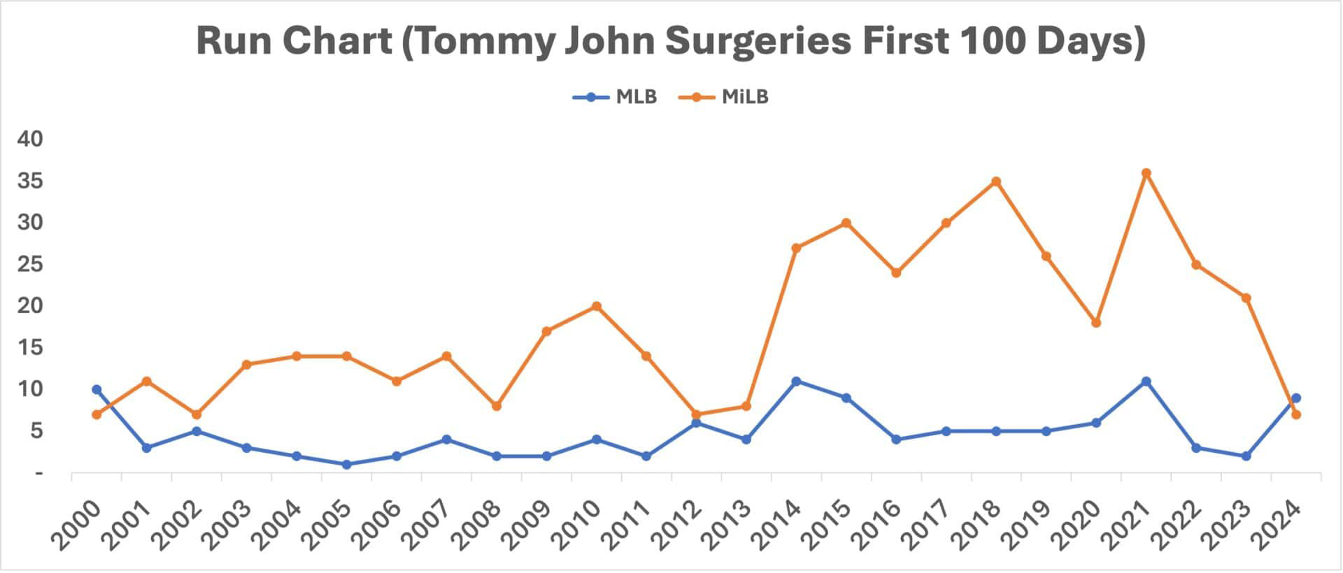
Doesn’t this view tell us so much more? For all of the concern about MLB surgeries, 2024 isn’t an unprecedented number; look at the years 2000, 2014, 2015, and 2021.
For those who want to blame the MLB pitch clock for the supposed increase in elbow injuries (a clock that was added to the major leagues in 2023), why did injuries fall in 2023 compared to 2022?
In the minor leagues, pitch clocks were generally introduced for the 2015 season. But there was an apparently large increase in elbow injuries requiring Tommy John surgery in the 2014 season.
So maybe something else is going on? But is there really a “special cause” (such as a change in rules or policies) that affected the number of injuries?
Best: Use process behavior charts
The best approach would be to use process behavior charts (PBCs), as I write about in my book, Measures of Success: React Less, Lead Better, Improve More (Constancy, 2018).
I created separate charts for MLB and MiLB. Each chart starts with a calculated average (the green line), and for an initial baseline, I’d use all of the data points from 2000 to 2024. Then, I calculate the lower limit and upper limit (shown in red lines).
If you’re unfamiliar with the calculations, you can find a detailed how-to in my book or in this blog post that I wrote for KaiNexus.
MLB chart:
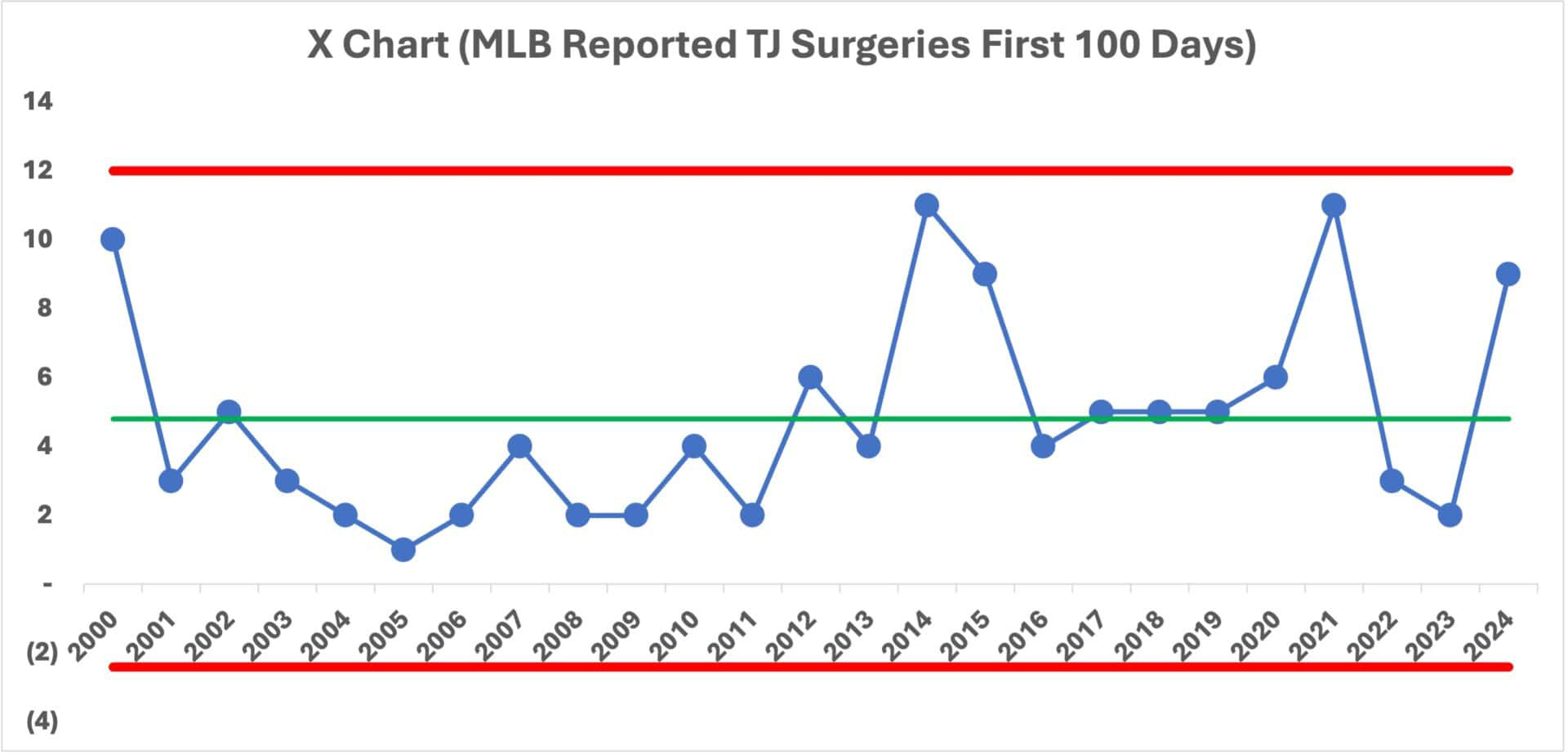
Is there any meaningful change in 2024? Have there been any significant changes over time?
To answer those questions, we use the main three rules for detecting a “signal”—an indication that the system has changed so, therefore, there is a “special cause” to identify.
The three rules are:
1) Any single data point outside of the limits? No.
2) Eight or more consecutive data points above or below the limits? Yes.
3) Three of four (or three consecutive) data points closer to a limit than the average? No.
The only signal we see is a run of below-average data points from 2003 to 2011. This indicates that there hasn’t been a “single consistent system” over time. Things have changed... but apparently not in 2024.
So I agree with the headline that concludes, “There’s no Tommy John surge this spring. (It’s always this bad)”
But is it “always this bad?” Not really.
Here’s a version of that chart that highlights the signal:

To me, the implication is that it appears there was a shift upward in Tommy John surgeries starting in 2012. What changed then? Were there more injuries? Or were players (and teams and surgeons) more willing to treat injuries with this procedure?
There’s a bit of an art to this, but I’m going to redo the chart using 2001 to 2011 as the baseline for calculating the average and limits.
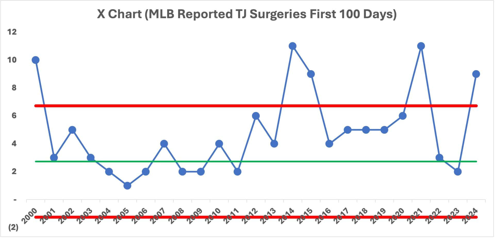
Starting in 2012, we see signals galore. The year 2012 is the first of 11 consecutive data points above that baseline average. Then the year 2014 is the first of a number of years above the baseline upper limit. As was the year 2000.
What changed in 2012? My next iteration of the chart uses 2012–2024 to calculate a new average and new limits.

What are my conclusions from this chart?
• 2024 isn’t an outlier that should be (or can be) explained.
• 2024 is “noise” in the new system that was apparently established in 2012.
• Starting in 2012, the average number of Tommy John surgeries more than doubled, from 2.7 to 6.2.
• The year-to-year variation also increased starting in 2012.
Why are there more surgeries in some years compared to others? It’s basically randomness.
Why is the number higher in 2024? We don’t know. There’s no special cause reason.
Why was the number lower in 2022 and 2023? We also don’t know. There’s no special cause reason.
Trying to explain those data points in isolation is a waste of time.
Some attribute the increase in injuries to pitchers throwing harder than they have before, which includes a common strategy of throwing every pitch as hard as you can instead of pacing yourself. Pitchers aren’t expected to throw a complete game (or last a minimum of seven innings) like they were through the 1980s.
This 2024 article by an expert MLB reporter, Tom Verducci, explores this: “There’s a Clear Root to the Injury Issues Plaguing Pitchers”
He writes, “The quest to increase velocity has come at too high of a cost: health. It must change.”
Verducci rightfully scolds Tony Clark, the MLB players union chief, for politicizing a single data point.
Another expert chimes in:
“Essentially the UCL (ulnar collateral ligament) is being pushed beyond what it can take,” says Glenn Fleisig, biomechanics research director of the American Sports Medicine Institute, a leader in his field, and a consultant to MLB. “We’ve developed a situation through mad science where we are pushing the body beyond what the ligament can handle.”
Did this push start in 2012? Or around then?
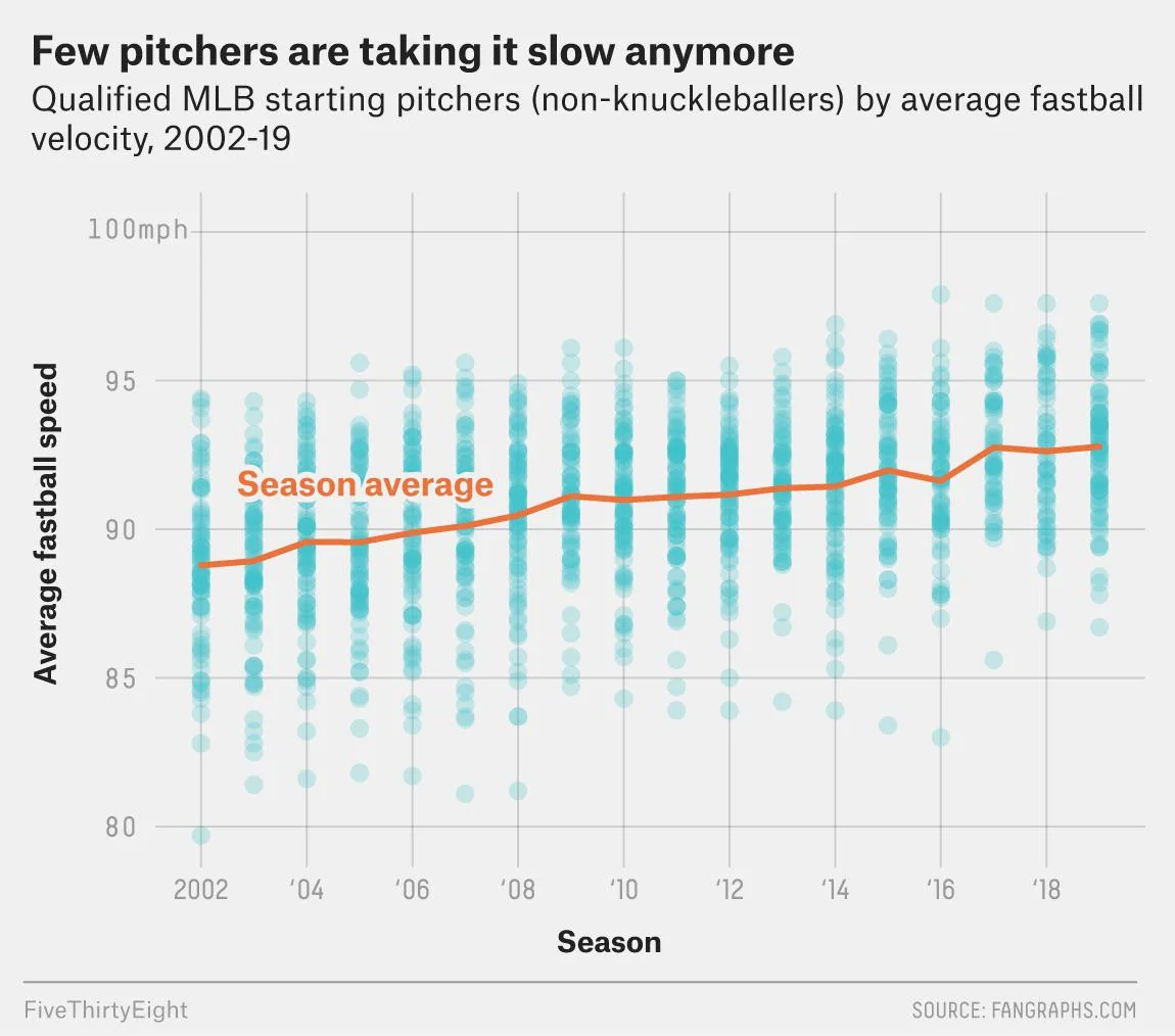
Verducci uses a line chart (I love it), looking at the average four-seam fastball velocity. I just wish the chart started before 2012. The number of surgeries isn’t quite going up linearly the way pitch speeds are.
Be warned: The scale of the Y-axis is a little bit visually misleading.

But I think the point is the same. It seems that the increase in surgeries lines up with how pitching at full-bore speeds affects the elbow and the UCL.
This article looks at average pitch speeds over the decades. The analysis is complicated, because the technologies and methods for measuring speed have changed. Pitch speed used to be measured at 50 feet from home plate, and now it’s measured at the point where the ball is released (a higher speed because air drag hasn’t slowed the ball yet). During the 1970s and 80s, pitch speed was measured much closer to home plate.
A Reddit post has data going back to 2002 and a chart:
As Verducci writes, that is the issue to look at, not the pitch clock.
Minor league baseball charts
Now let’s look at the process behavior charts for MiLB. Here’s my baseline chart using all years for the average and limits:
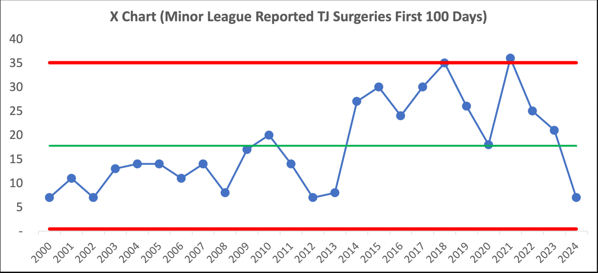
It seems there’s a similar jump, but this time starting about 2014 in the minor leagues. We see signals including eight points below the average, eight points above, and a data point above the upper limit. It’s clearly not a single system over those 24 years. Something changed.
So, I’ll redraw the averages and limits to show that shift:


I’d almost expect to see headlines asking, “Why are Tommy John Surgeries Down So Much in the Minors?”
Think of how misleading the analysis would be with just two data points (“MiLB Tommy John Surgeries Down Two Thirds From Last Year”) or just four (“MiLB Tommy John Surgeries Down 81% Since 2021!”)
A partial graph would be totally misleading:
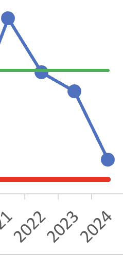
The 2024 minor league data point isn’t a signal worth explaining. Neither is the 2024 major league data point.
Conclusion
The surge in Tommy John surgeries among MLB and MiLB players highlights the complexity of understanding variation within such data. What has changed in 2024? Nothing. Stop trying to explain it in terms of “what happened this year?”
Despite alarming headlines and narratives of a supposed (or suspected) injury epidemic, exploring the data using process behavior charts suggests that what we’re observing isn’t a sudden outbreak but rather a variation that falls within historical norms, albeit with a noticeable shifts update starting from specific years, 2012 or 2014. We could and should ask, “What happened in that time frame?”
This reinforces the importance of interpreting sports injury data—or any data—within the context of established historical patterns rather than an isolated year’s statistics. It also underscores the need for continual, context-rich analysis to discern between true shifts in patterns and mere fluctuations.
Such insights not only show us the actual dynamics of pitcher injuries but also guide more effective responses, whether in medical interventions or changes in training and game strategies. Thus, while the quest for increased velocity among pitchers might correlate with injury rates, the broader lesson is the crucial role of nuanced data analysis in forming effective policies and practices in sports health management—or any management data or situation in other industries.
Published April 16, 2024, on Mark Graban’s Lean Blog.
Comments
No "Shift" in Velocity
I totally agree that control charts are the best way to display and understand process data. (Interesting that Wheeler used control chart format to compare the home run hitting of Mantle and Maris in his book "Understanding Variation")
And I like constructing the final chart to show some manner of shift around 2012. I still don't feel like I understand what it was that changed then, but it seems clear that we went from one stable range of performance, to another stable range.
The display of velocity vs. year does not appear to help, given that it's a steady-ish trend with 2012 smack in the middle of it.
But I hope Dr. Wheeler will appreciate the use of "process behavior" charts.
Add new comment